Hi everyone,
Google Summer of Code is ending and its time to let all know what all was done in this amazing 3 months of coding...so here is goes..
1) Default Column-Header and Row-Header

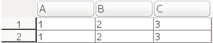
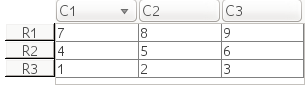
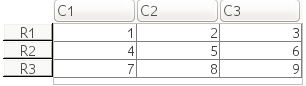
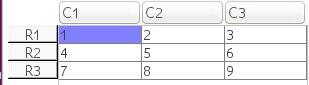
This is a example of a standard table which can be formed by running the code
The row-header and column-header are provided by user.
Now user also has the facility to leave the column/row headers blank and default values will automatically be displayed in place of rows and columns.
This can be achieved in the following way:
The column-header has default values from " A..Z - AA..ZZ " while the row-header has values from 1 to n where n is number of rows,
User can now also provide column/ row label for specific column/row respectively.
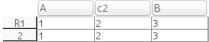
-> columnHeader = ["" "" "c2" "" ]; -> rowHeader = ["R1" ""]'; -> colData_1= ["1" "1"]'; -> colData_2 = ["2" "2"];
-> colData_3 = ["3" "3"];
-> table = [columnHeader; [ rowHeader colData_1 colData_2 colData_3 ]]
-> ut = uicontrol("style","table",.. "string",table,.. "position",[5 as(2)-100 300 87])
User can also mention just the column header or just the row header.
Value of data in the cell can be changed via double clicking the particular cell and changing the data, or setting the data value in cell programmatically.
PS: Any change in the table through gui will automatically reflect in table's data string which can be seen programmatically using string property of uitable handle
-> table_handle.string
2) Tool-tips
Initially the Tool-tip property was just displayed on hovering the top-left corner.
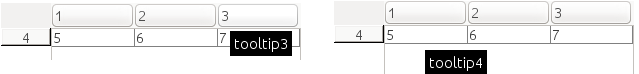
Now the user can set tooltip for each and every cell including column headers.
To make the value of each cell as the tooltip one can simply set the tooltip property of Scilab uitable handle equal to "values".
This can be done simply by following code:
-> ut.tooltipstring = "values";
User can also mention specific tooltip for column-header and table cell.
This could be done simply by following code:
-> ut.tooltipstring = ["tooltip1" "tooltip2" "tooltip3" "tooltip4" "tooltip5" "tooltip6"];
Empty strings can be passed in the tooltip matrix to not display tooltip for that particular cell or header.
-> ut.tooltipstring = ["" "" "tooltip3" "tooltip4" "" "tooltip6"];
Note: There are no tooltips for row-headers.
3) Interactive Features
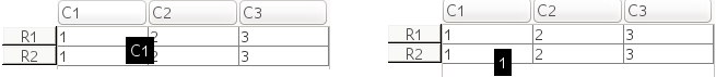
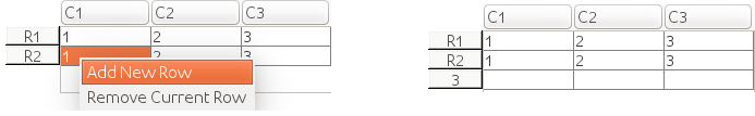
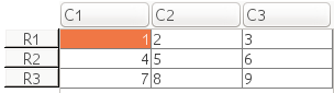
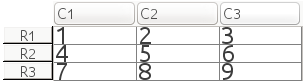
User can now add a new row at the end of table or remove a particular row not only programmatically but through GUI as well.
User can click any cell of row which has to be removed and then right click the selected cell and select remove row from the pop up appeared.
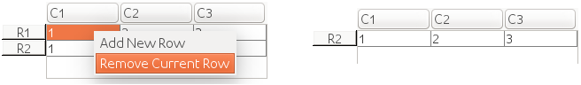 The above image shows how through GUI user can remove a particular row.
PS: Any change in the table will automatically reflect in table's data string which can be seen programmatically using string property of uitable handle
-> table_handle.string
4) Sorting Table
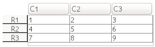
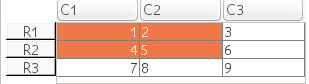
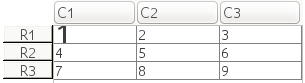
Users can now sort the complete table both programmatically and through GUI. The below figure is a example table on which I will be demonstrating sorting.
By default single column sorting is enabled for the uiTable i.e on clicking column headers that particular column is sorted.
For example clicking the first column would sort the column in descending order.
Re-clicking the same column will sort the column in opposite order.
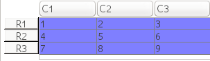
User can sort the complete table with respect to particular column (Including the Row Headers) by first disabling " singlecolumnsortable " property of uitable
-> ut.singlecolumnsortable = "off";
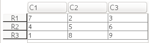
Once disabled on clicking the column-header of any column will sort the complete table with respect to that column (Including Row Headers).
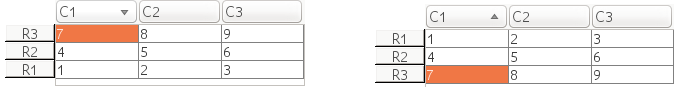
As shown in the above figure the other columns are sorted with respect to the 1rst column. The row-headers are also rearranged according to 1rst column. The small symbol near the column name displays the sort order.
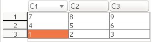
There might be cases when there would be a need to keep the row-headers fixed while sorting the rest of them table. This can be achieved using "rowheaderfix" property of uitable.
-> ut.rowheaderfix = "on";
And the result is as expected :)
If default values for row header is used then the default values will not be sortable (in built rowheaderfix is on )
To sort a particular column programmatically user can use sort function.
-> sort(ut, "1", "Ascending");
OR
-> ut.sortcolumn = ["1" "Ascending"];
Param: 1) ut is the table handle
2) "1" is the column number. (C1)
3) "Ascending" Sort order.

PS: Any change in the table will automatically reflect in table's data string which can be seen programmatically using string property of uitable handle
-> table_handle.string
5) Horizontal/Vertical Alignment
Users can now set horizontal and vertical alignment to cell data of complete table or cell data of particular column.
Setting alignment to cell data of the complete table will be done via :
//Horizontal Alignment
-> ut.horizontalalignment = "center"
Values that can be given as input are : left | center | right
Similarly :
//Vertical Alignment
-> ut.verticalalignment = "top"
Values that can be given as input are : top|middle|bottom
Column Alignment:
User can specify horizontal/vertical alignment for cell data in particular column.
It can be achieved through:
-> columnNmuber = "1"
-> ut.horizontalcolumnalignment = [ columNumber "right" ]
User can also specify class for each column in uitable
-> columnClass = ["integer" "integer" "integer"]
-> ut.columnclass = columnClass
Specifying Column class will change the alignment according to JTable policies of column Alignment.
The above figure is result of the setting class of each column as Integer.
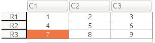
6) Single Cell Selection
Initially user were not allowed to select a single cell instead the complete row was selected. Now the user can select each cell and can make multiple cell selections.
Single Cell selection can be seen in all the mentioned examples.
7) Font and background/foreground color
User can now change foreground/background color of the complete table or for each cell individually
For the complete table user can use the backgroundcolor/foregroundcolor property of uitable
-> ut.backgroundcolor = [0.5,1,1]
Similarly for a fore-ground color.
For a particular cell user can use the cellbackgroundcolor/cellforegroundcolor property of uitable
-> row_number = "1"
-> column_number = "1"
-> color = "[0.5,1,1]"
-> ut.cellbackgroundcolor = [color row_number column_number]
User can also make font changes to data of cell or of complete table.
User can change the font color, font name, font weight and font size.
For example to change font size of complete table, user can:
-> ut.fontsize = 25
For particular cell user can:
-> row_number = "1"
-> column_number = "1"
-> size = "25"
-> ut.cellbackgroundcolor = [size row_number column_number]
_______________________________________________________
Following is the link to view all my commits to code-review in Scilab:
Commit Details
Google Summer of Code is ending and its time to let all know what all was done in this amazing 3 months of coding...so here is goes..
1) Default Column-Header and Row-Header

This is a example of a standard table which can be formed by running the code
-> columnHeader = [" " "C1" "C2" "C3" ];
-> rowHeader = ["R1" "R2"]';
-> colData_1= ["1" "1"]';
-> colData_2  = ["2" "2"];
-> colData_3 = ["3" "3"];
-> table = [columnHeader; [ rowHeader colData_1 colData_2  colData_3 ]]
-> ut = uicontrol("style","table",..
               "string",table,..
               "position",[5 as(2)-100 300 87])
The row-header and column-header are provided by user.
Now user also has the facility to leave the column/row headers blank and default values will automatically be displayed in place of rows and columns.

This can be achieved in the following way:
-> columnHeader = ["" "" "" "" ];
-> rowHeader = ["" ""]';
-> colData_1= ["1" "1"]';
-> colData_2  = ["2" "2"];
-> colData_3 = ["3" "3"];
-> table = [columnHeader; [ rowHeader colData_1 colData_2  colData_3 ]]
-> ut = uicontrol("style","table",..
               "string",table,..
               "position",[5 as(2)-100 300 87])
The column-header has default values from " A..Z - AA..ZZ " while the row-header has values from 1 to n where n is number of rows,
User can now also provide column/ row label for specific column/row respectively.

-> columnHeader = ["" "" "c2" "" ]; -> rowHeader = ["R1" ""]'; -> colData_1= ["1" "1"]'; -> colData_2 = ["2" "2"];
-> colData_3 = ["3" "3"];
-> table = [columnHeader; [ rowHeader colData_1 colData_2 colData_3 ]]
-> ut = uicontrol("style","table",.. "string",table,.. "position",[5 as(2)-100 300 87])
User can also mention just the column header or just the row header.
Value of data in the cell can be changed via double clicking the particular cell and changing the data, or setting the data value in cell programmatically.
PS: Any change in the table through gui will automatically reflect in table's data string which can be seen programmatically using string property of uitable handle
-> table_handle.string
2) Tool-tips
Initially the Tool-tip property was just displayed on hovering the top-left corner.
Now the user can set tooltip for each and every cell including column headers.
To make the value of each cell as the tooltip one can simply set the tooltip property of Scilab uitable handle equal to "values".
This can be done simply by following code:
-> ut.tooltipstring = "values";
User can also mention specific tooltip for column-header and table cell.
This could be done simply by following code:
-> ut.tooltipstring = ["tooltip1" "tooltip2" "tooltip3" "tooltip4" "tooltip5" "tooltip6"];
Empty strings can be passed in the tooltip matrix to not display tooltip for that particular cell or header.
-> ut.tooltipstring = ["" "" "tooltip3" "tooltip4" "" "tooltip6"];
Note: There are no tooltips for row-headers.
3) Interactive Features
User can now add a new row at the end of table or remove a particular row not only programmatically but through GUI as well.
User can click any cell of row which has to be removed and then right click the selected cell and select remove row from the pop up appeared.
The above image shows how through GUI user can remove a particular row.PS: Any change in the table will automatically reflect in table's data string which can be seen programmatically using string property of uitable handle
-> table_handle.string
4) Sorting Table
Users can now sort the complete table both programmatically and through GUI. The below figure is a example table on which I will be demonstrating sorting.

By default single column sorting is enabled for the uiTable i.e on clicking column headers that particular column is sorted.
For example clicking the first column would sort the column in descending order.

Re-clicking the same column will sort the column in opposite order.
User can sort the complete table with respect to particular column (Including the Row Headers) by first disabling " singlecolumnsortable " property of uitable
-> ut.singlecolumnsortable = "off";
Once disabled on clicking the column-header of any column will sort the complete table with respect to that column (Including Row Headers).
As shown in the above figure the other columns are sorted with respect to the 1rst column. The row-headers are also rearranged according to 1rst column. The small symbol near the column name displays the sort order.
There might be cases when there would be a need to keep the row-headers fixed while sorting the rest of them table. This can be achieved using "rowheaderfix" property of uitable.
-> ut.rowheaderfix = "on";

And the result is as expected :)
If default values for row header is used then the default values will not be sortable (in built rowheaderfix is on )

To sort a particular column programmatically user can use sort function.
-> sort(ut, "1", "Ascending");
OR
-> ut.sortcolumn = ["1" "Ascending"];
Param: 1) ut is the table handle
2) "1" is the column number. (C1)
3) "Ascending" Sort order.

PS: Any change in the table will automatically reflect in table's data string which can be seen programmatically using string property of uitable handle
-> table_handle.string
5) Horizontal/Vertical Alignment
Users can now set horizontal and vertical alignment to cell data of complete table or cell data of particular column.
Setting alignment to cell data of the complete table will be done via :
//Horizontal Alignment
-> ut.horizontalalignment = "center"
Values that can be given as input are : left | center | right

Similarly :
//Vertical Alignment
-> ut.verticalalignment = "top"
Values that can be given as input are : top|middle|bottom
Column Alignment:
User can specify horizontal/vertical alignment for cell data in particular column.
It can be achieved through:
-> columnNmuber = "1"
-> ut.horizontalcolumnalignment = [ columNumber "right" ]

User can also specify class for each column in uitable
-> columnClass = ["integer" "integer" "integer"]
-> ut.columnclass = columnClass
Specifying Column class will change the alignment according to JTable policies of column Alignment.

The above figure is result of the setting class of each column as Integer.
6) Single Cell Selection
Initially user were not allowed to select a single cell instead the complete row was selected. Now the user can select each cell and can make multiple cell selections.

Single Cell selection can be seen in all the mentioned examples.
7) Font and background/foreground color
User can now change foreground/background color of the complete table or for each cell individually
For the complete table user can use the backgroundcolor/foregroundcolor property of uitable
-> ut.backgroundcolor = [0.5,1,1]

Similarly for a fore-ground color.
For a particular cell user can use the cellbackgroundcolor/cellforegroundcolor property of uitable
-> row_number = "1"
-> column_number = "1"
-> color = "[0.5,1,1]"
-> ut.cellbackgroundcolor = [color row_number column_number]

User can also make font changes to data of cell or of complete table.
User can change the font color, font name, font weight and font size.
For example to change font size of complete table, user can:
-> ut.fontsize = 25

For particular cell user can:
-> row_number = "1"
-> column_number = "1"
-> size = "25"
-> ut.cellbackgroundcolor = [size row_number column_number]

_______________________________________________________
Following is the link to view all my commits to code-review in Scilab:
Commit Details


